Te Puna Mahara Brand Guidelines
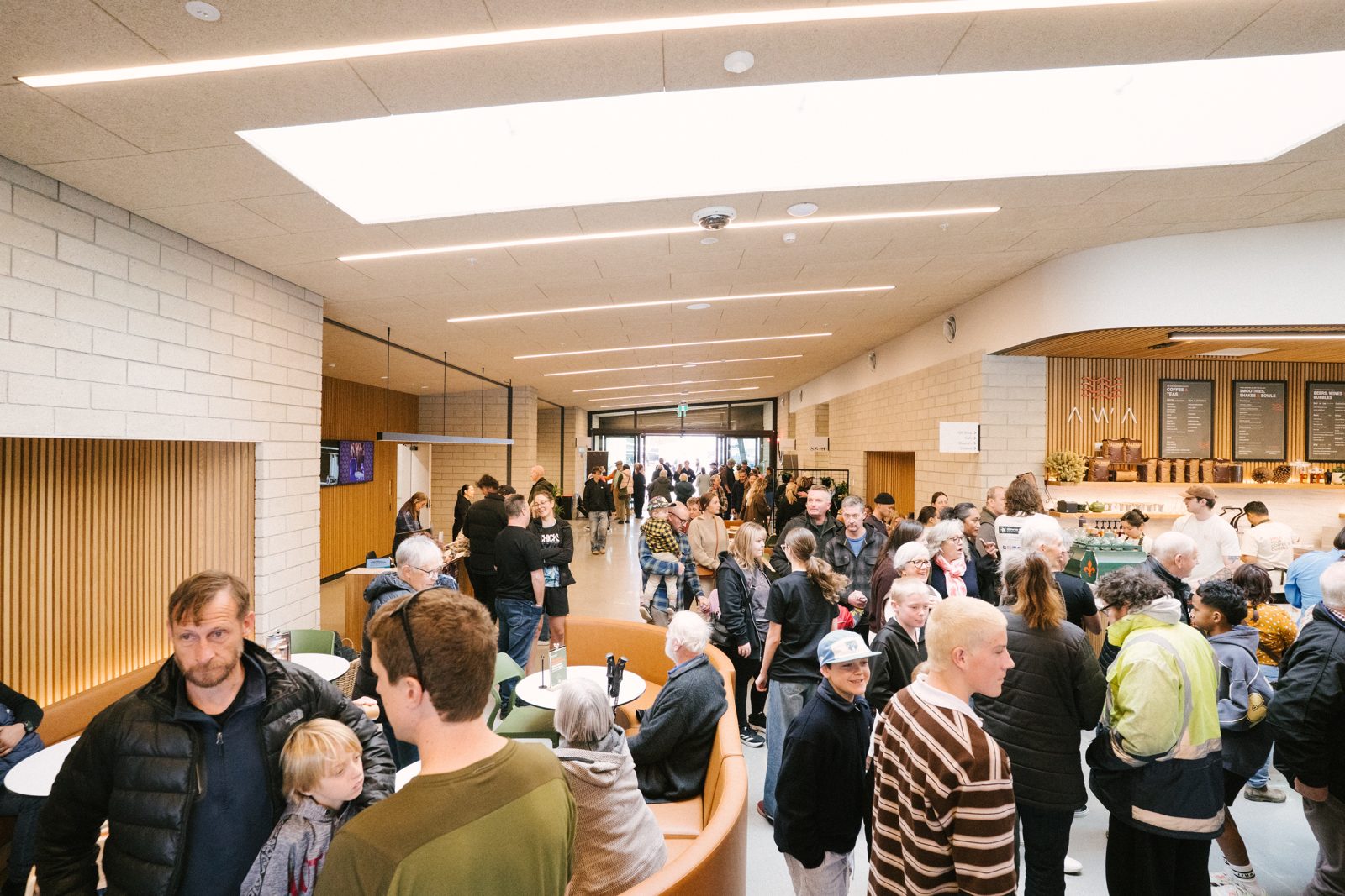
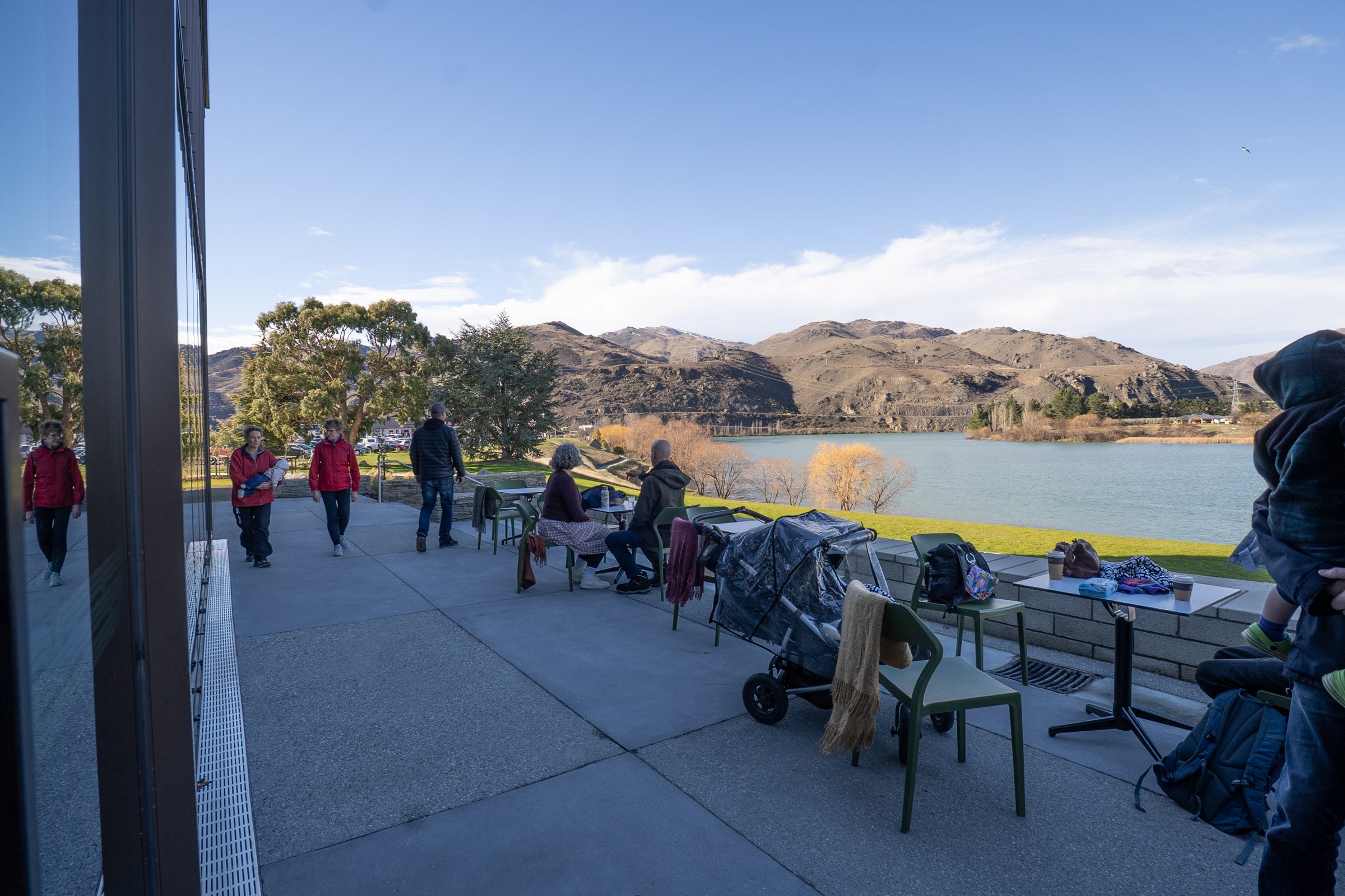
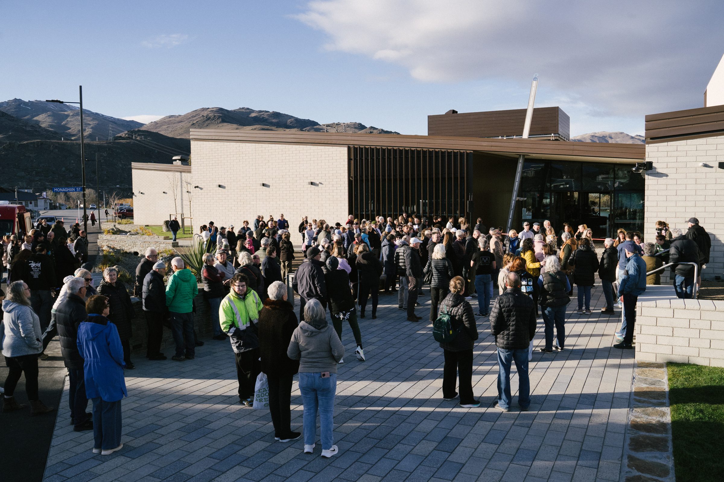
Opening day crowd gathered outside Te Puna Mahara, Cromwell

Brand
guidelines

Central Otago District CouncilPrepared by RemarkOctober 2026Version 1.0

Everything you need to keep the brand consistent

These are the Te Puna Mahara brand guidelines, prepared by Remark for the CODC team. They record the thinking, the locked assets, the rules, and the worked examples from the opening season, so anyone producing material for the venue can do it without guesswork.

Use it alongside the asset pack in the files folder beside this page. Every logo and the website pattern and wave motifs are in there, and the Files section at the end lists what each folder holds. The display font, the source slides and the full-resolution opening-season artwork come in the full asset pack from Remark.

One thing to know up front: the risograph illustration style shown in the June presentation video was retired after Board review. It is not part of this brand, so do not reuse it.

Once in a generation

Te Puna Mahara is the most ambitious thing Cromwell has built. A meeting place for many, not the few. A home for remembrance and a home for creativity. A genuine crossroads, where not only the three waters but a whole community come together.

Bold, courageous, fresh, modern, iconic. A brand that belongs on the global stage and still feels of Central Otago. It does not cower and it does not talk like council. It makes Cromwell cool.

The brand came out of a kickoff with the Cromwell Community Board, the Mayor and the Te Puna Mahara stakeholders, then a series of working sessions with the CODC team through May and June 2026. It nests inside the Aukaha cultural integration narrative already built into the building, and sits alongside the refreshed Central Otago regional identity rather than inside it.

Three river lines meeting, labelled Mata-Au, Kawarau, Te Wairere

The junction. Mata-Au, Kawarau and Te Wairere meet beside the building, and the brandmark is traced from these water lines.

Three words that every touchpoint should carry

Use these to check any piece of work. If it does not bring people closer together, welcome everyone, or stand tall, it is not finished.

Tone of voice

Write the way the values sound. Short sentences. Confident, warm, direct. Name the venue as Te Puna Mahara on first mention, with Cromwell Memorial Events Centre as the descriptor where context is needed. Lean on te reo where it is natural and correct, and keep macrons: Te Puna Mahara, kaumātua, manaakitanga.

Avoid

  • Council-speak: facility, utilise, stakeholders, in due course.
  • Apologetic hedging. State what is on and why it matters.
  • Long titles where the wordmark alone would do.
  • Exclamation marks doing the work the typography already does.
Crowd gathered outside the building on opening day

Connection

The junction. Where three rivers meet and a community gathers. Every touchpoint should tell a story of bringing people closer together.

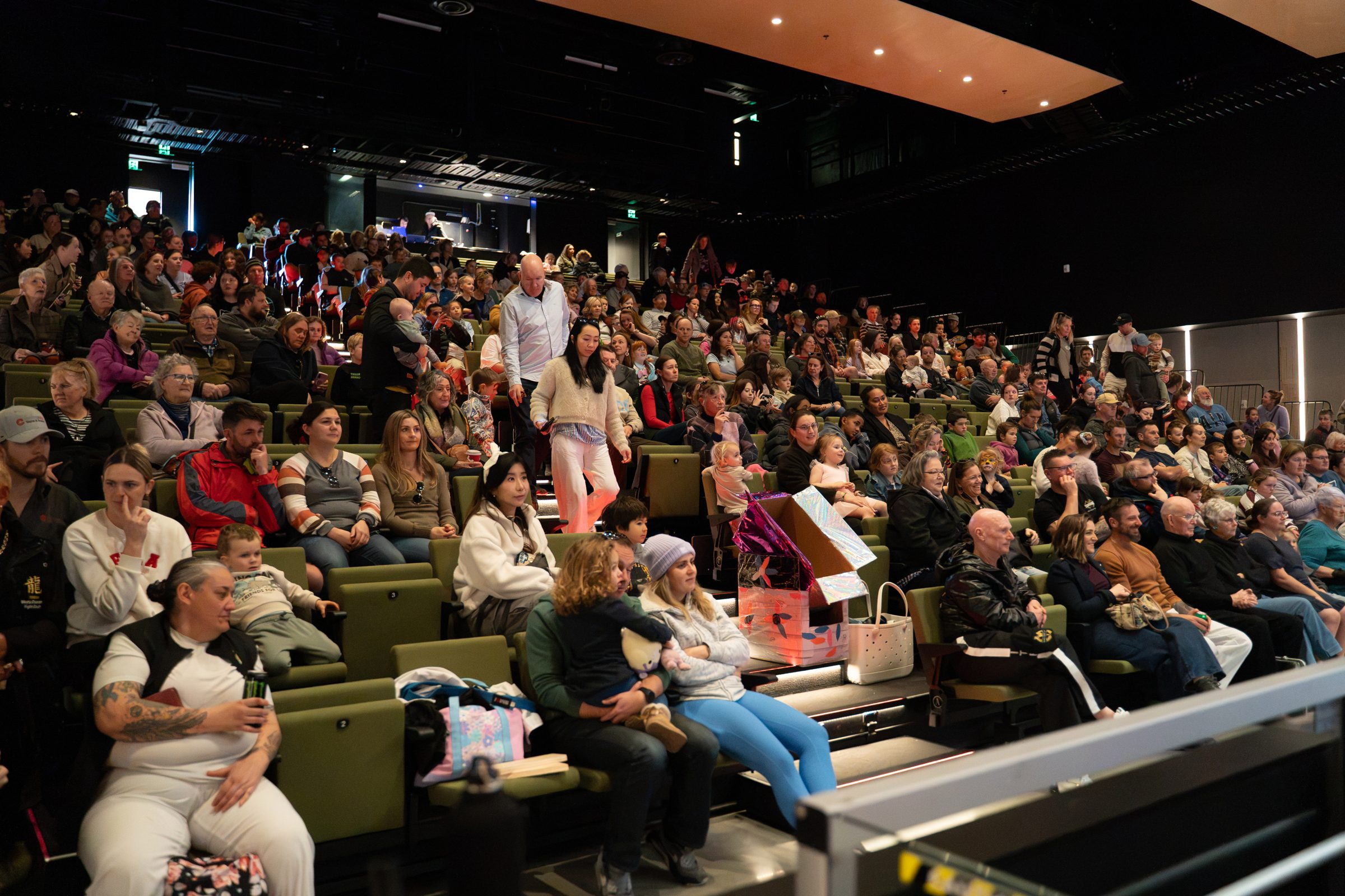
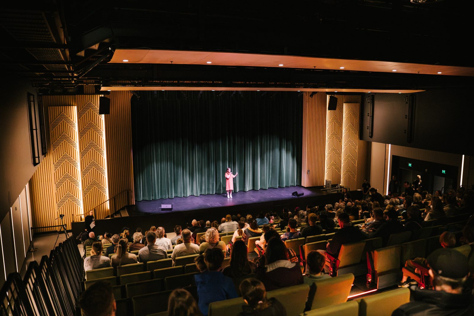
A full auditorium watching a show

Community

A meeting place for many, not the few. For kids, teens, seasonal workers, locals and kaumātua. Open, accessible and welcoming to all. This is manaakitanga.

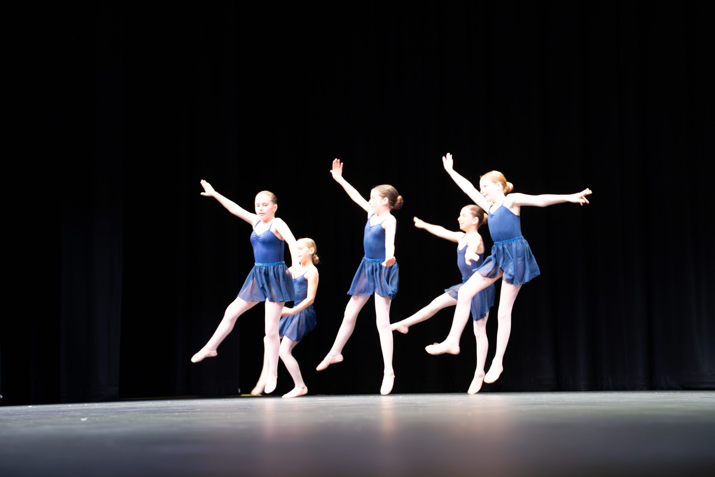
Young dancers mid-leap on the main stage

Courageously bold

Loud, iconic and alive. We demand attention and never apologise for it. Too cool for council, brave enough to lead, a brand that feels at home on the global stage.

Colour me Central

The palette is drawn from the refreshed Central Otago colour vocabulary, so Te Puna Mahara reads as the region's landmark venue without wearing the council logo.

Colours work in pairs. Plum and red are the primary pair and carry most of the brand. Blue and yellow are the secondary pair for variety, lighter moods and seasonal work. The functional palette does the quiet jobs: body text, backgrounds, and anywhere the brand colours would shout too much. Pairs can be mixed across the groups, as in the plum-on-yellow lockup, as long as contrast stays strong.

PlumHEX 4A2143RGB 74 33 67CMYK 0 56 10 71 approx.
RedHEX BA1F3FRGB 186 31 63CMYK 0 83 66 27 approx.
BlueHEX 4890C2RGB 72 144 194CMYK 63 26 0 24 approx.
YellowHEX FDB624RGB 253 182 36CMYK 0 28 86 1 approx.
Schist greyHEX C2C7CARGB 194 199 202Functional
BlackHEX 000000RGB 0 0 0Functional
CreamHEX F3F1E4RGB 243 241 228Functional
WhiteHEX FFFFFFRGB 255 255 255Functional
PlumRed
Primary pair
BlueYellow
Secondary pair
PlumYellow
Cross pair, high contrast

Print. CMYK values above are conversions from the screen colours. Before a large print run, ask the printer for a proof and match to these HEX values. There are no Pantone references locked for this brand yet.

How much of each

Plum is the ground. Most layouts start with a plum panel or a plum full bleed. Red is the energy, used for headline echoes, bands and calls to action. Yellow is the thin rule and the highlight. Blue is a change of mood for daytime, family and community pieces. Cream and white carry text on dark panels.

Accessibility

White on plum, white on red and plum on yellow all pass for body text. White on blue reaches 3.5 to 1, which passes for large type and bold headings but not for body text. Yellow on white and red on plum do not pass, so keep those combinations to large display type or decorative use.

Dontawild and Mulish

Dontawild
ABCDEFGHIJKLMNOPQRSTUVWXYZ 0123456789 ĀĒĪŌŪ
Display. Always uppercase.
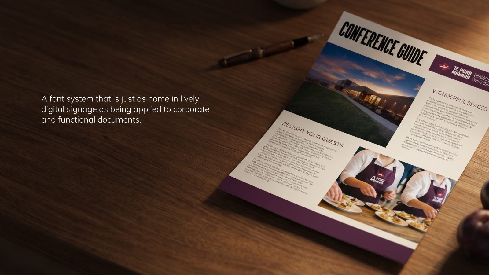
Mulish does the calm, readable work everywhere else. It shares its sans role with the regional identity, so we stay coherent with Central Otago while standing apart.
Light caps, letterspaced, for subtitles
Body, captions, subtitles. Weights 300, 400, 600, 700.

Dontawild is where the brand gets loud: the descriptor in the lockup, headlines, poster titles, event names, big numbers. It is dense, compact and contemporary, and it carries a hint of old cinema fronts and vintage signage. Set it in capitals, tight, with a little tracking only when it is small. The font was extended in July 2026 with macron glyphs, so te reo headings set correctly. Use the July 2026 file from the asset pack, not an older copy.

Mulish is the body face. It is the current name of the Google font formerly called Muli, which is what the June presentation calls it. It is free, installed on the website already, and available in Canva and Microsoft 365 through Google Fonts.

Headline
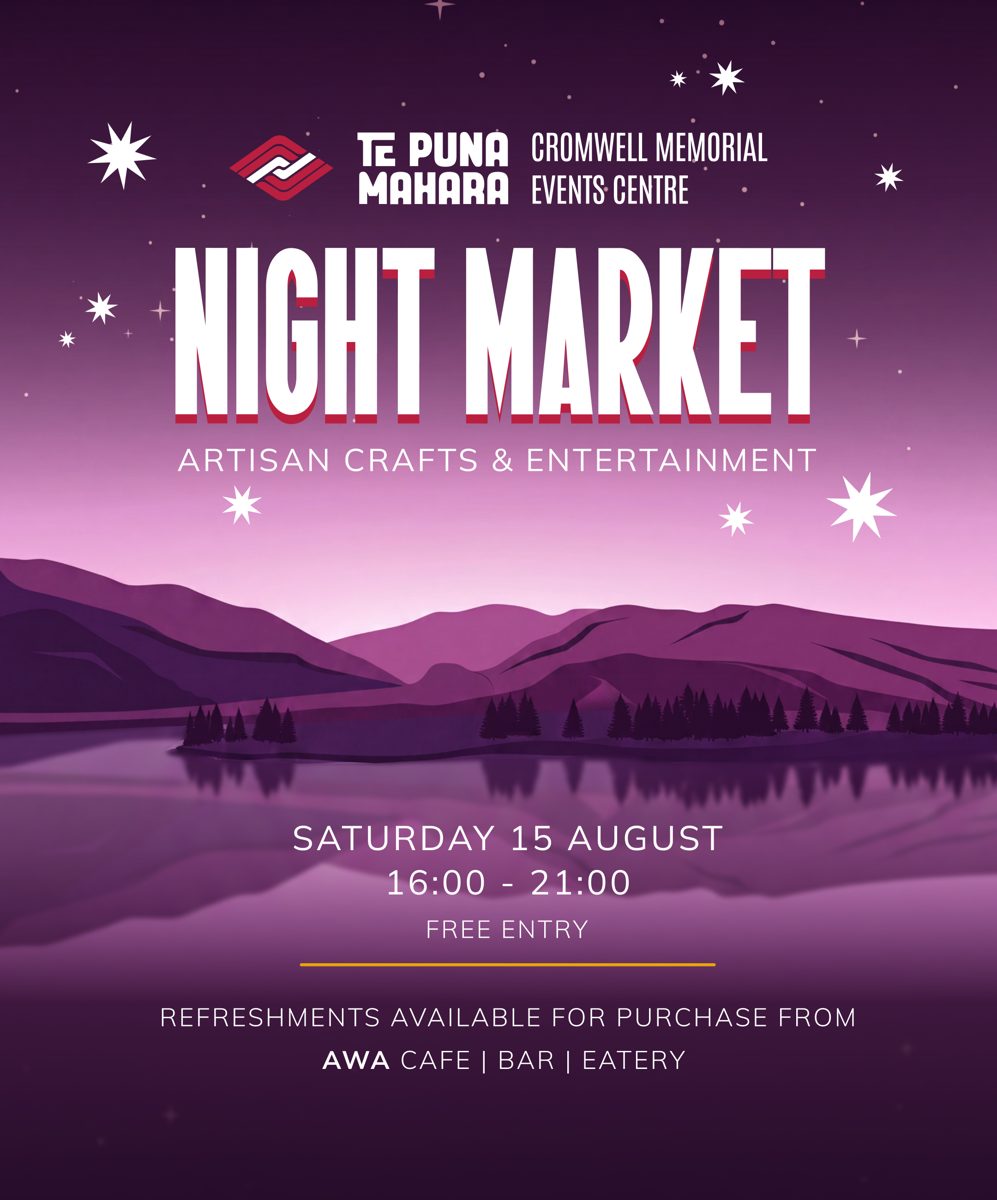
Night market
Subtitle
Artisan crafts and entertainment
Section head
Wonderful spaces
Body
Central Otago offers the perfect backdrop for events, 45 minutes from Queenstown International Airport.
Detail
Saturday 15 August, 16:00 to 21:00, free entry

The headline echo

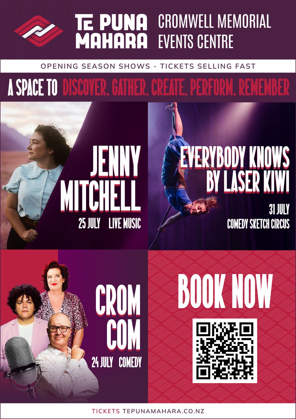
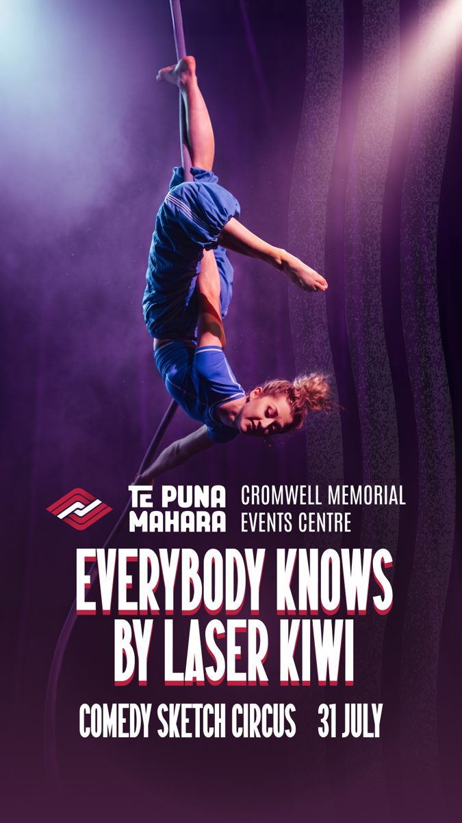
The signature typographic move across the opening season: a white Dontawild headline on plum with a hard red offset behind it, down and to the right. It appears on the A5 flyer, the newspaper launch ads and every show poster. Keep the offset small, around five percent of the cap height, and never blur it. On yellow or cream, drop the echo and set the headline in plum.

Tickets live tomorrow Opening season shows, tickets selling fast

The cascade

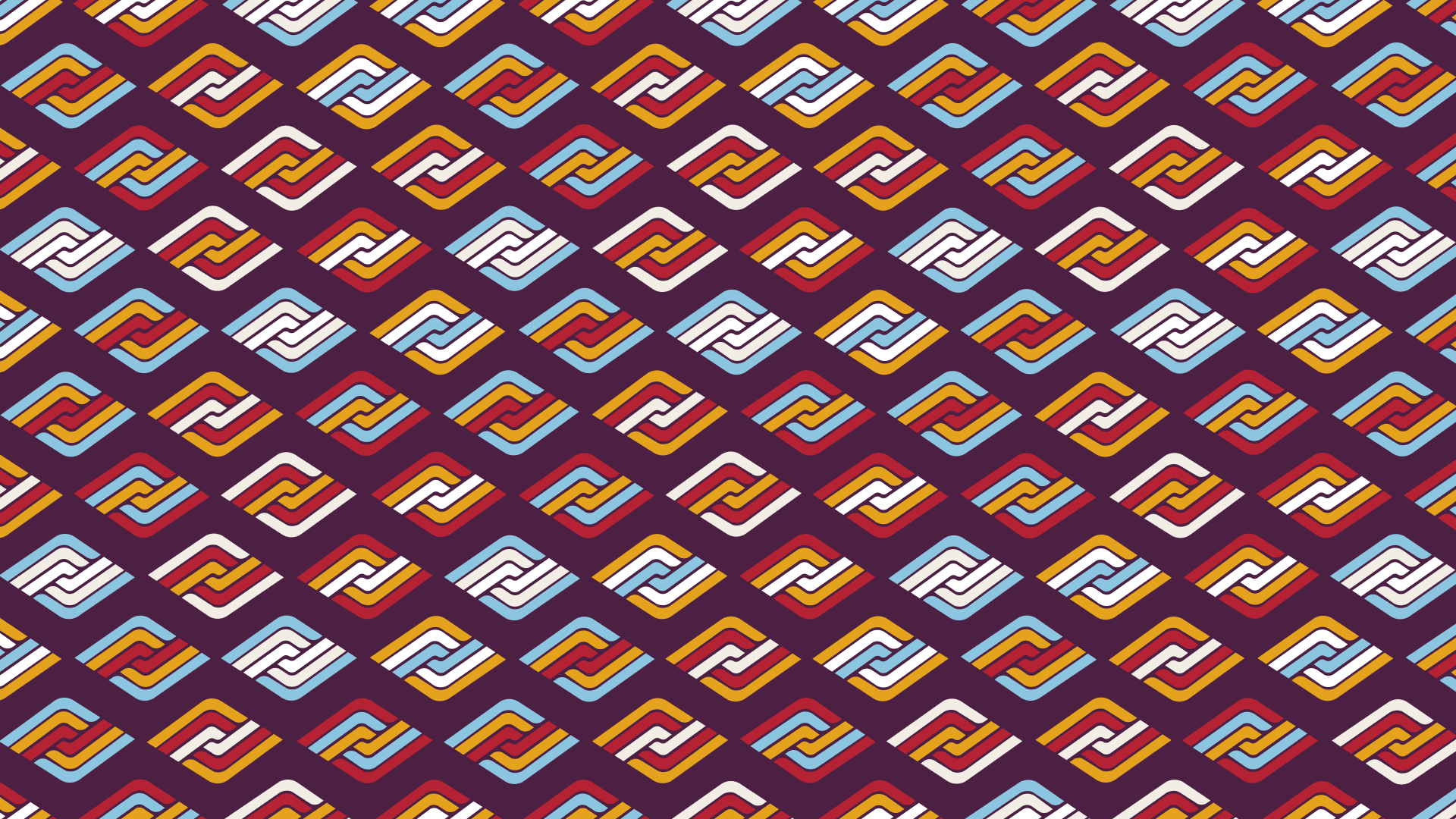
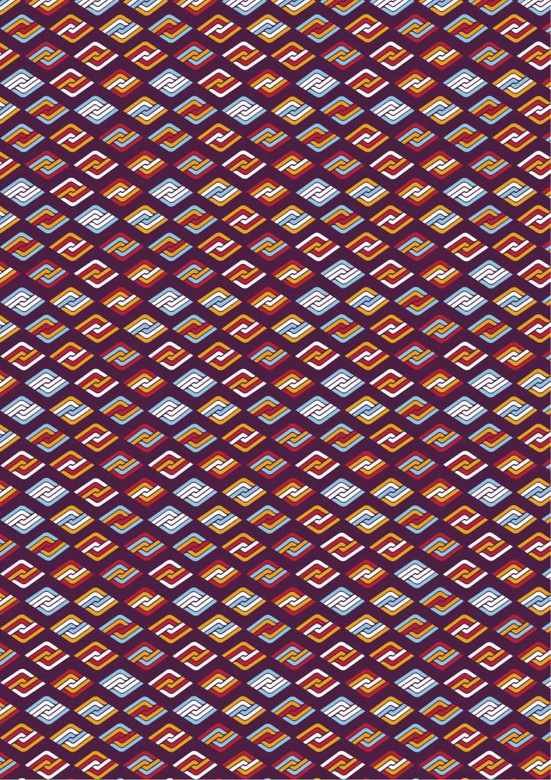
The brandmark repeated in a diagonal cascade, cycling through red, yellow, blue and cream on plum. It is the brand's texture for backgrounds, panels, merchandise, wrapping and the moments when a surface needs life without a photo.

Use it at a scale where the marks read as marks, never shrunk to noise. Keep it off body text. On the website it sits behind headers and section breaks as a tile. For print, the A4 version in the full asset pack is set for a full-bleed page.

Cascade pattern, landscape. The website tile is in files/motifs.

Motifs from the website

The Te Puna Mahara website carries the brand with six recurring moves. Use the same ones in any digital work, so the venue looks the same wherever people meet it.

Brand pattern
overlay

Brand pattern overlay

A seamless tile of the brandmark laid over plum with a soft-light blend and a soft diagonal light. It runs on the footer, the What's On banner, the mobile menu and every plum band.

Keep the blend soft so the mark reads as texture. Files: brand-pattern-tile.png at 200 px, and brand-pattern-tile.svg.

The puna wave

The puna wave

Three grainy water lines, the puna or springs, run along the foot of light sections: page headers, the booking box, forms and the subscribe band.

Keep it faint, 25 to 45 percent opacity, behind the content and only on cream or white. File: wave-texture.png.

A space toperform

The rolling word

The home page headline holds its first words still and rolls the last one: perform, gather, remember, create, celebrate, discover. The verbs are what people come here to do.

Roll one word only, in Dontawild, every two to three seconds. Hold it still for anyone with reduced motion turned on.

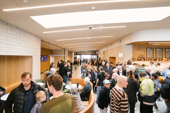
Foyer
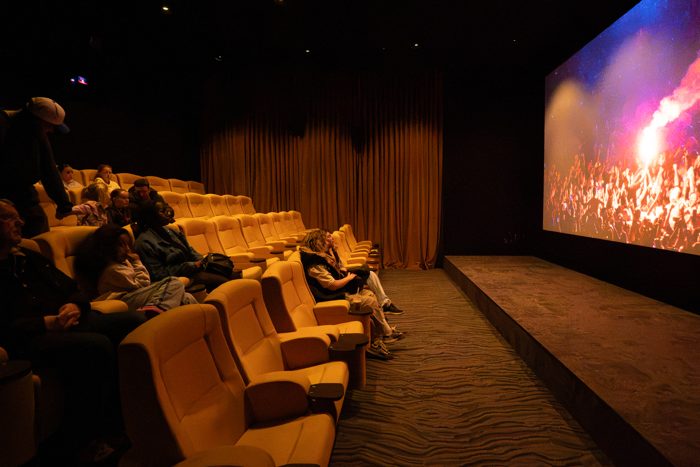
Cinema
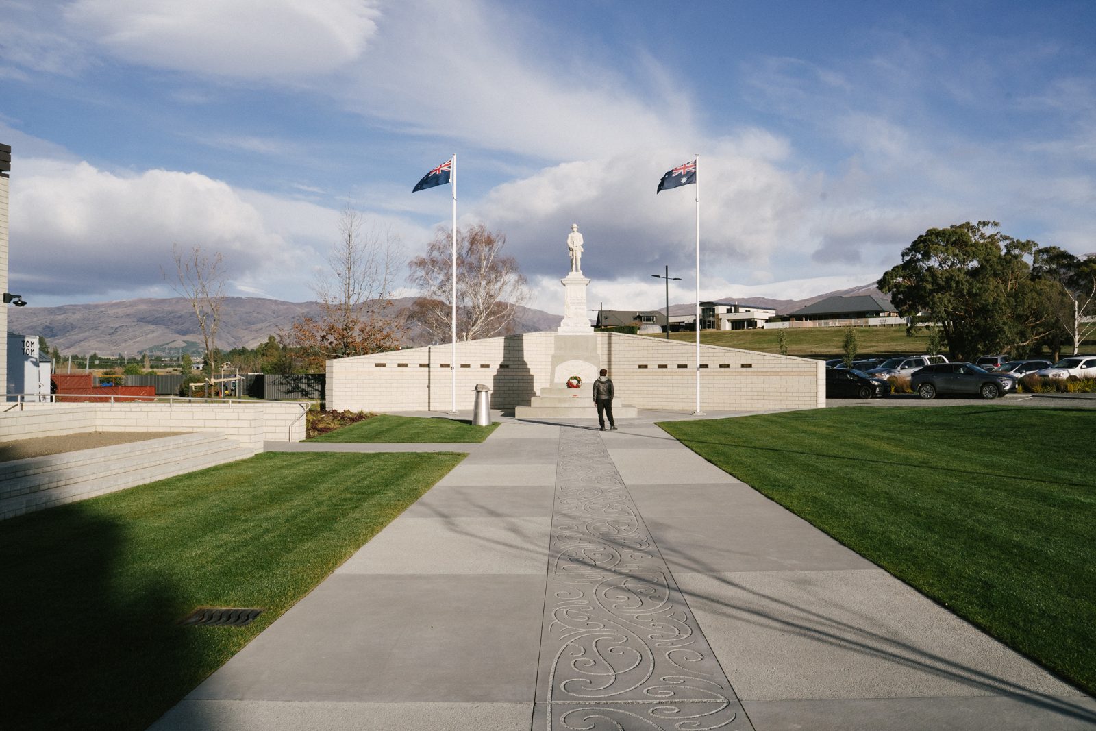
Memorial
Edge-to-edge image cards

Spaces and events sit in a tight grid with no gaps, running the full width of the screen under a plum heading band. The name sits on a dark fade at the foot of the photo and the description rises in on hover.

Photos scale slowly when hovered, never snap.

Opening17 July

Big numbers on plum

Dates and countdowns are set huge in Dontawild on a plum pattern band, with the label above in Mulish bold caps and wide letterspacing. The opening date set the pattern.

Use tabular figures in countdowns so the numbers do not jump as they change.

Cromwell, Central Otagotepunamahara.co.nz

The text bar

A slim plum strip carrying the pattern and one line of Mulish bold caps, sitting flush under a hero image. It holds the facts people scan for, such as hours, dates or a location.

One line only. A cream version with the puna wave exists for light pages.

How it all comes together

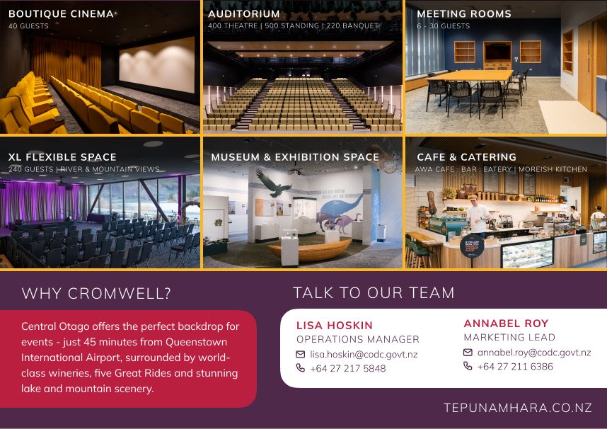
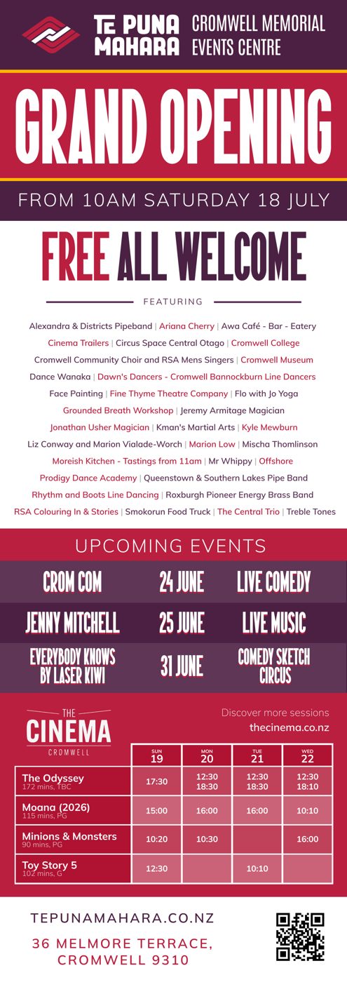
Worked examples from the brand presentation and the opening season. Each one follows the same handful of moves: a plum ground, a Dontawild headline with the red echo, a Mulish subtitle in light letterspaced caps, one strong photo, a thin yellow rule, and the lockup top left.

Digital screens

Print

Social and show artwork

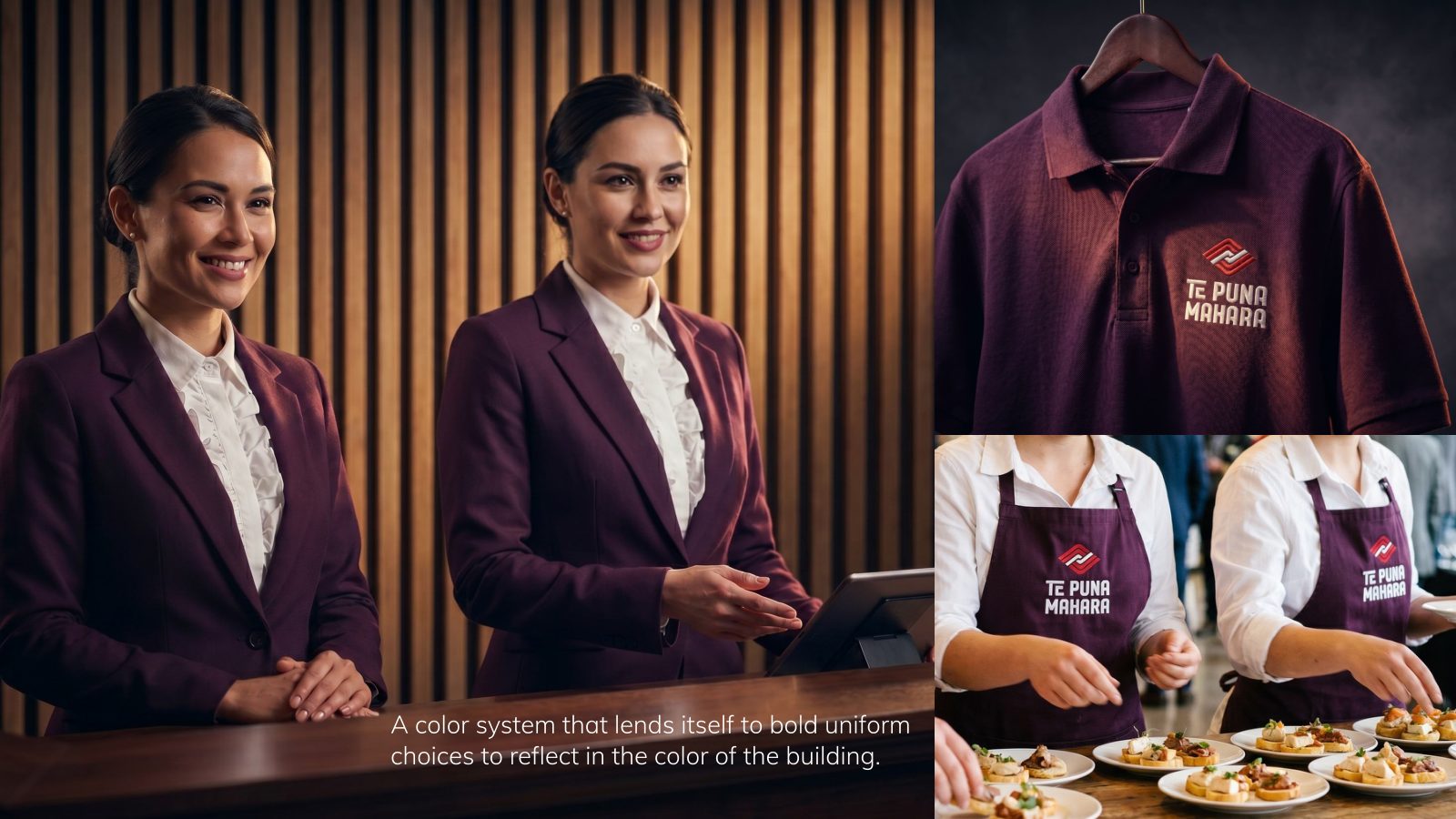
Uniforms and merchandise

Layout habits worth keeping

  • Lockup top left, horizontal, white or red-and-white, on a plum band or clear photo area.
  • Website address in Mulish caps, letterspaced, top right or in the footer band: tepunamahara.co.nz.
  • Diagonal photo cuts between panels, never soft fades, to echo the mark's angles.
  • Thin yellow rule to separate headline from detail on dark grounds.
  • One photo per piece. Let it be big. Grids of six are for the spaces page, not posters.
  • QR code on a red panel when the piece is printed and there is a ticket link.

Real spaces, real people, warm light

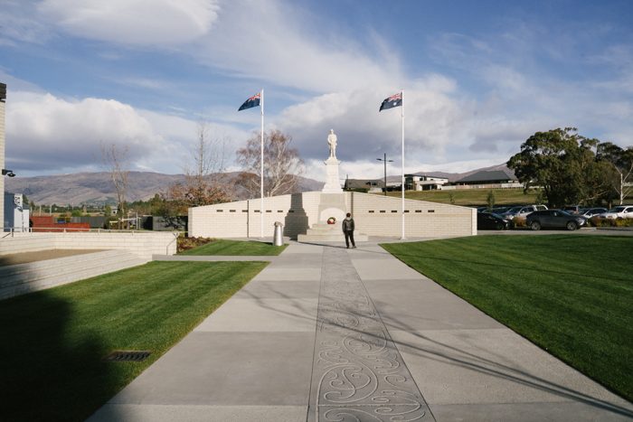
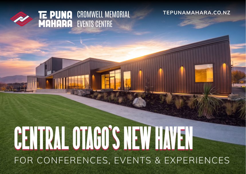
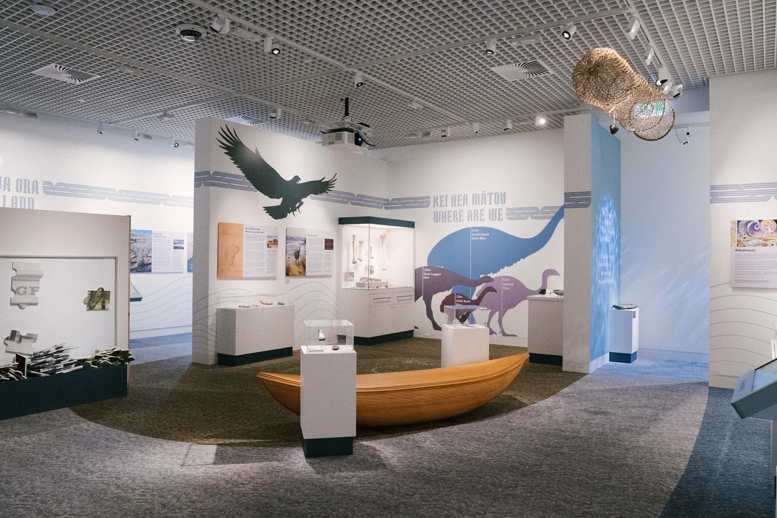
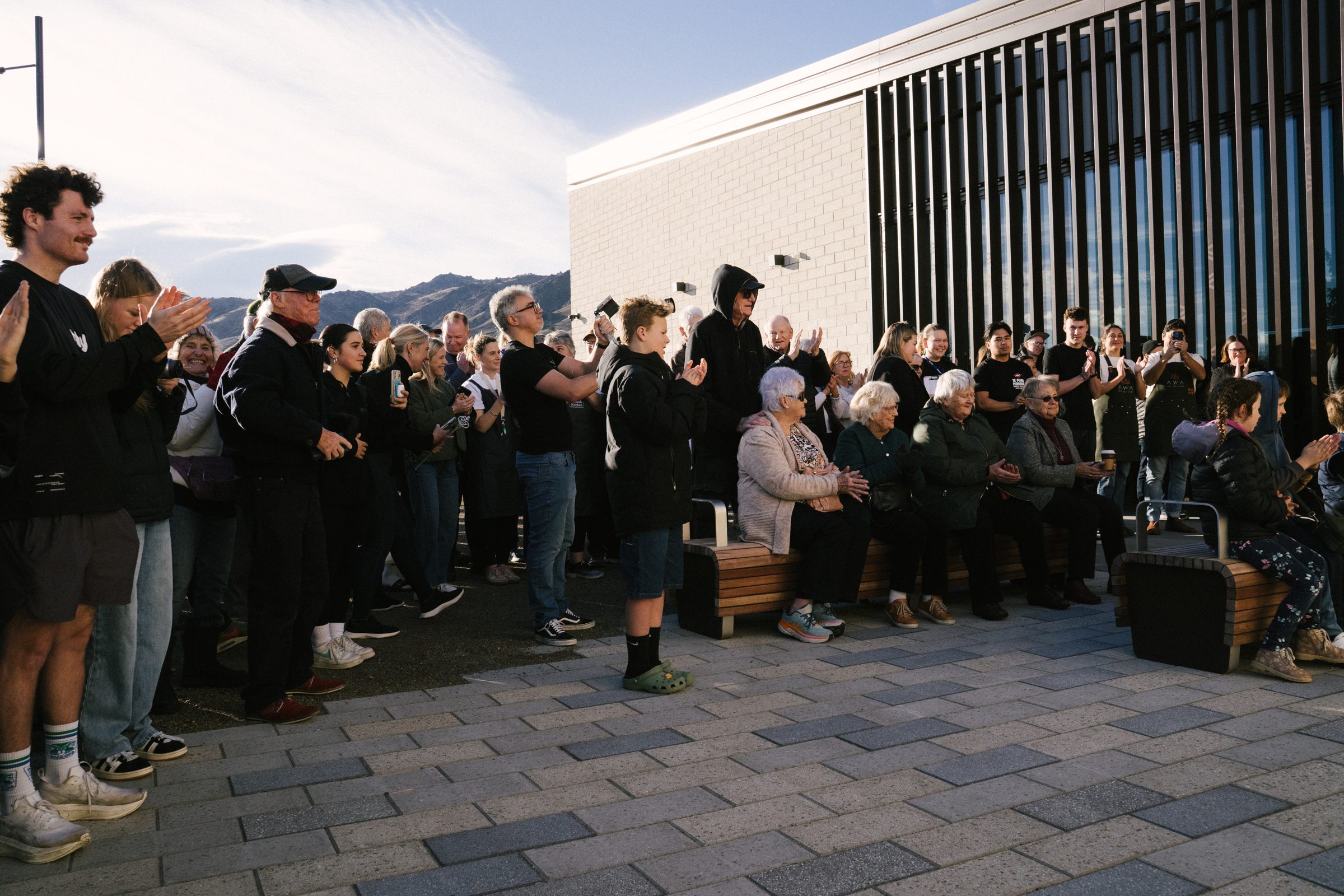
The building is the hero. Show it full of people, with the mountains behind. Inside, show spaces in use and people mid-moment rather than posed. Use real photography of the venue only, never renders or mock-ups. Every image on this page is from the opening day, 20 July 2026. Keep colour natural and warm. The brand colours come from the graphics, not from grading the photos.

Event imagery

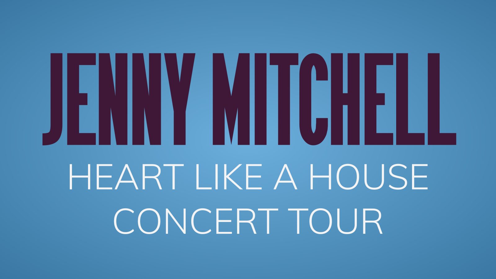
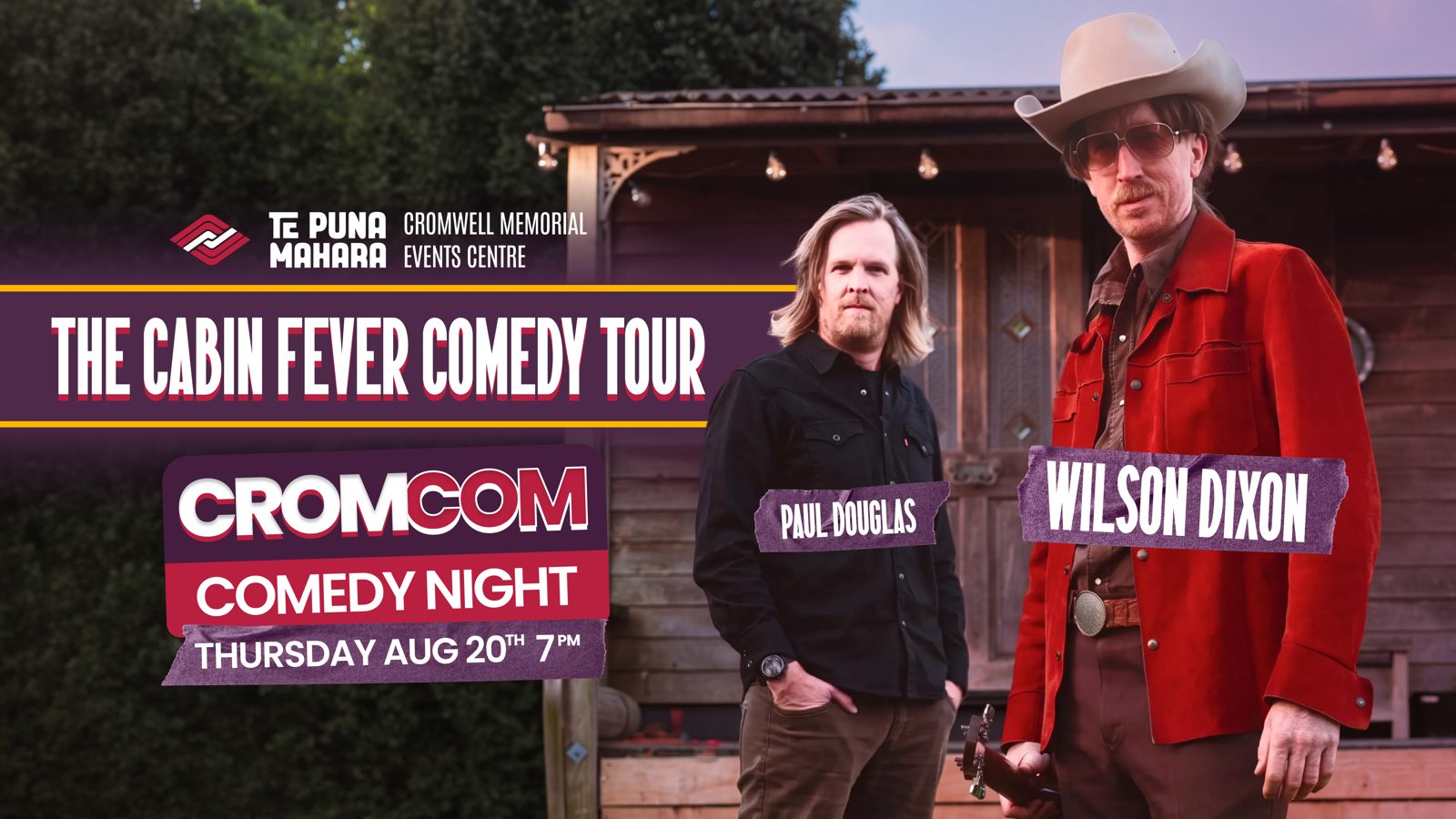
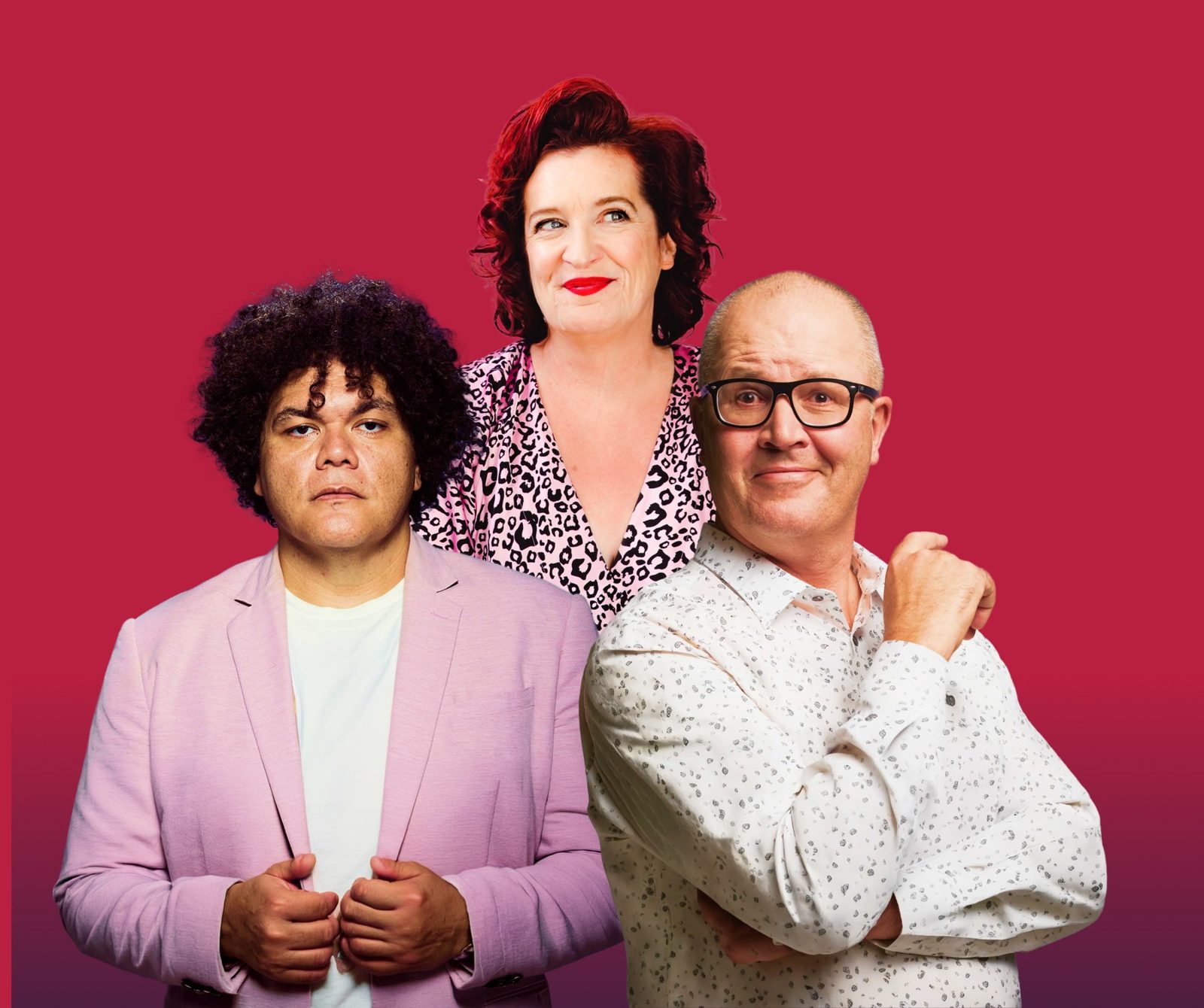
The spread that follows uses photos from the opening season's What's On listings, as they run on the website. Promoters and partners supply their own images, so use them as supplied, give each one room, and keep the brand graphics around the photo rather than over it.

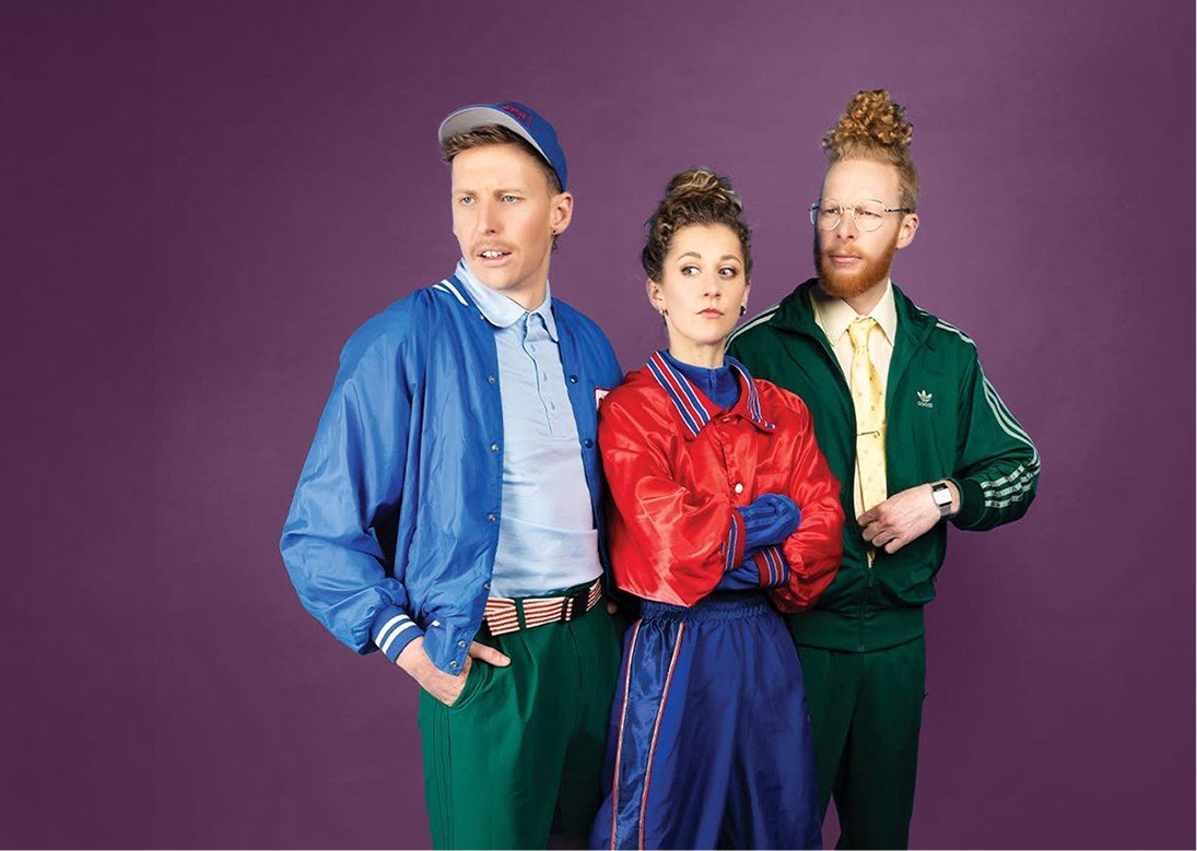
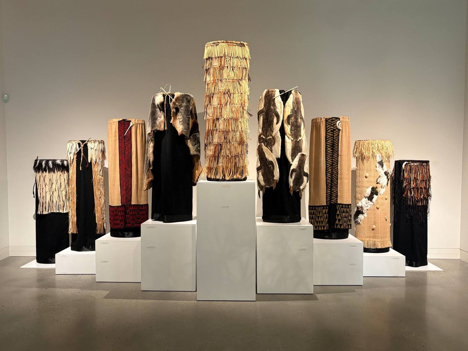
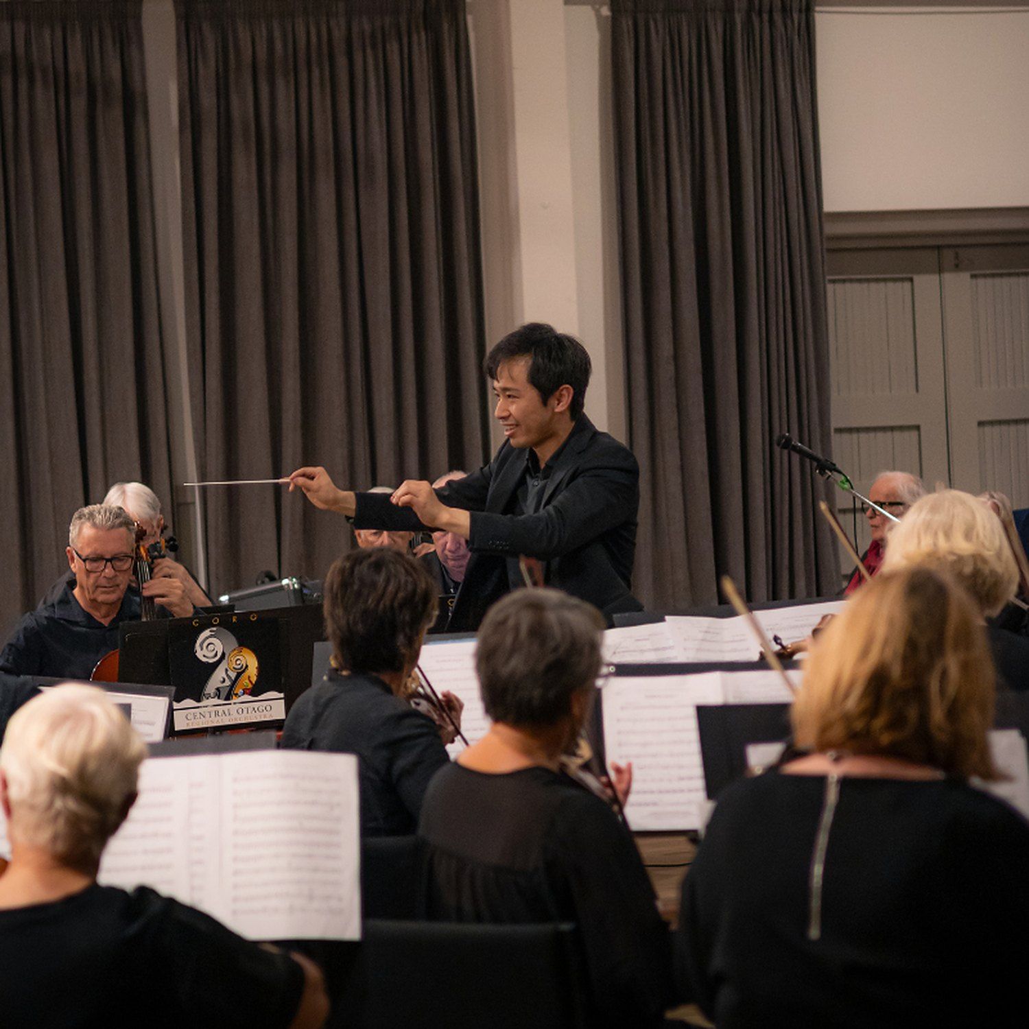
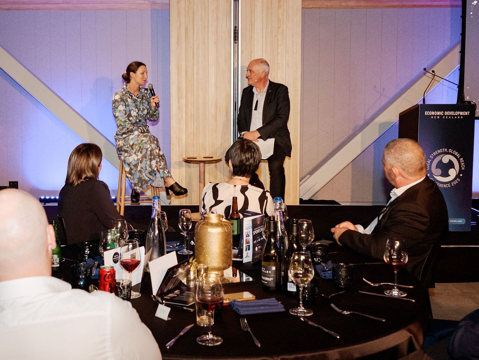
Event imagery from the opening season's What's On listings. Use promoter photos as supplied, give each one room, and keep the brand graphics around the photo rather than over it.
Woven korowai and kete on plinths in the exhibition space
Roka's Woven LegacyInaugural exhibition
Orchestra rehearsing with conductor
AscentCentral Otago Regional Orchestra
Panel on stage at a conference dinner
EDNZ 2026Conference
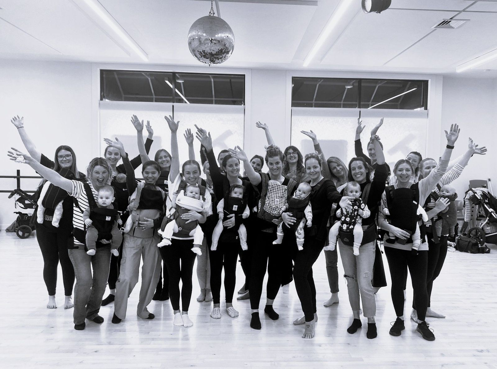
Parents dancing with babies in carriers
Pēpē Wearing DanceClass
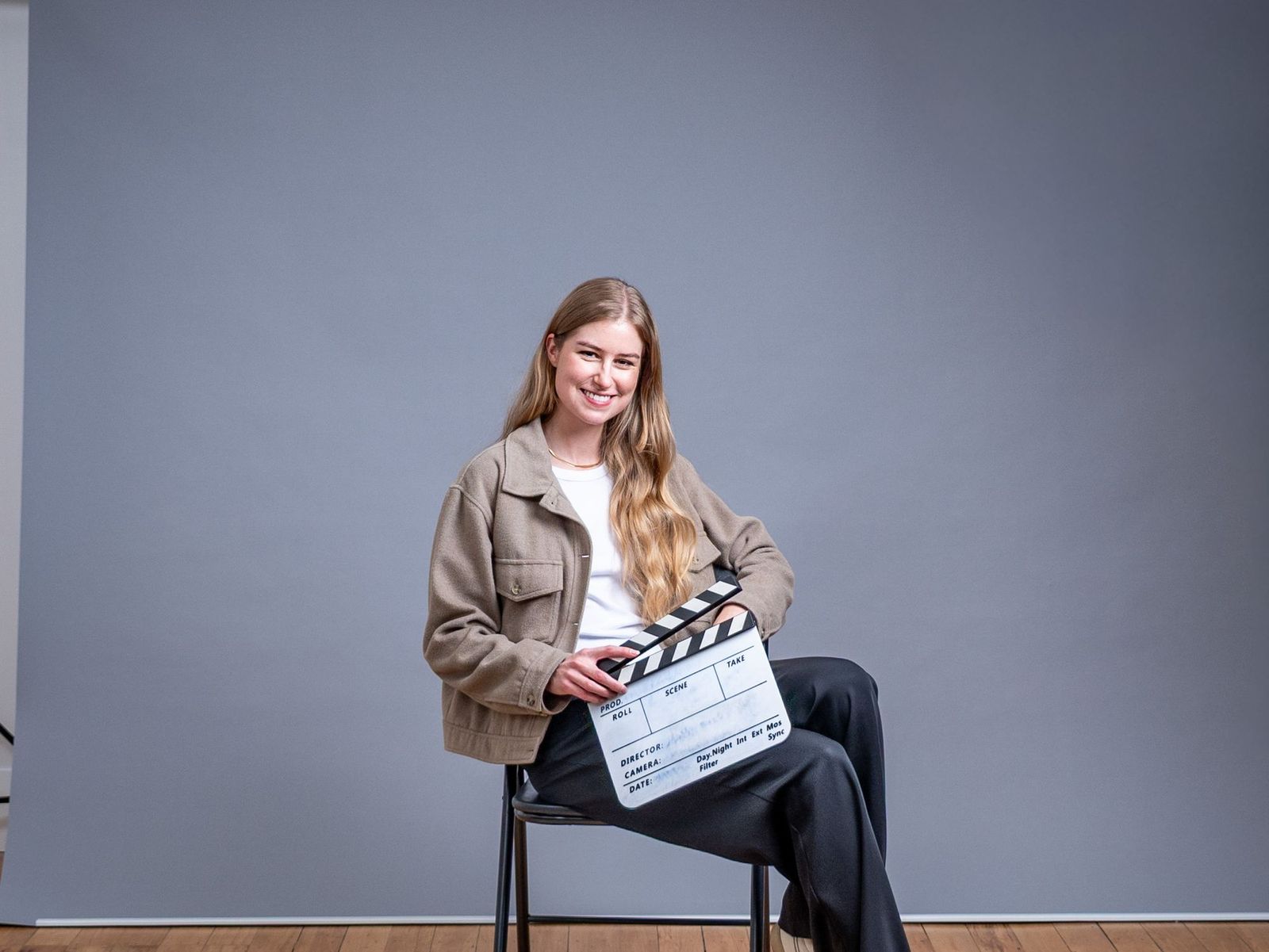
Young actor holding a clapperboard
Screen Teens ActingClass
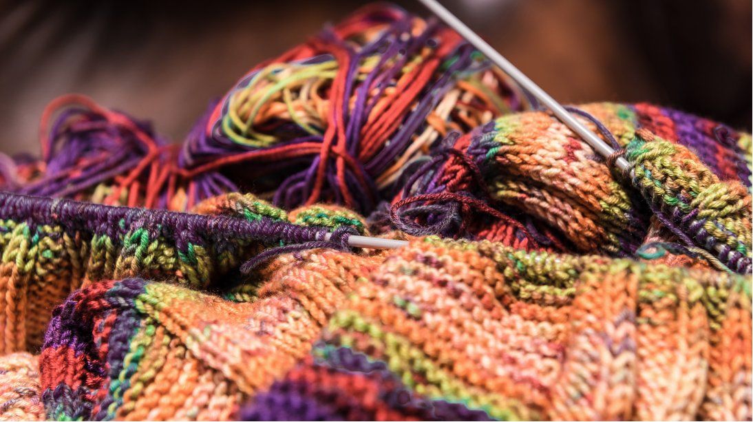
Close-up of knitting in bright yarn
Fibre SocialCommunity
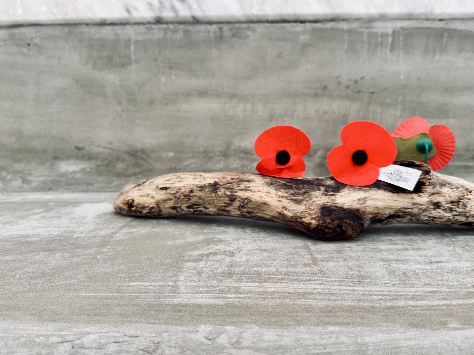
Red poppies on driftwood
Cromwell RSARemembrance
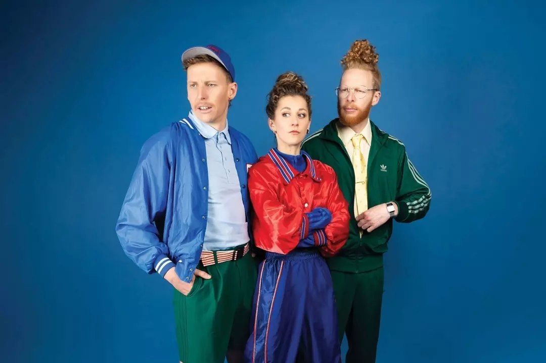
Laser Kiwi performers in bright tracksuits
Laser KiwiComedy

Files

Every logo and pattern supplied to CODC is hosted at tpm-brand-assets.pages.dev. Link to these files rather than emailing copies, so everyone works from the same set. Download everything as a zip.

Horizontal lockup

On plum panelSVGPNGPNG large
On plum panel, gradient mark (digital)SVGPNGPNG large
For light backgroundsSVGPNGPNG large
White, for dark or photo backgroundsSVGPNGPNG large
White, gradient mark (digital)SVGPNGPNG large
All white, soft shadingSVGPNGPNG large
Black, one-colour printSVGPNGPNG large

Stacked lockup

On plum panelSVGPNGPNG large
On plum panel, gradient mark (digital)SVGPNGPNG large
For light backgroundsSVGPNGPNG large
White, for dark or photo backgroundsSVGPNGPNG large
White, gradient mark (digital)SVGPNGPNG large
All white, soft shadingSVGPNGPNG large
Black, one-colour printSVGPNGPNG large

Other logos and patterns

Logo without descriptor, whiteSVG
Stacked with descriptor, whiteSVG
Black on white, square 1200 pxPNG
Colourful cascadePNGPNG large
Plum cascadePNG
Website pattern tilePNG

files/logos

  • Brandmark: digital with gradient, flat red and white, yellow and white, mono plum
  • Horizontal lockups: on dark, on light, on blue, mono white
  • Stacked lockups: on dark, on light, on yellow, mono black
  • Wordmark, mono white

files/motifs

  • brand-pattern-tile.png and .svg, the website pattern tile
  • brand-pattern.svg, the cascade as vector
  • wave-texture.png, the puna wave

Full asset pack

  • Dontawild font, July 2026 build with macrons
  • A4 cascade pattern for print
  • Source slide PDFs and full-resolution opening-season artwork
  • Supplied by Remark on request
Te Puna Mahara, Cromwell Memorial Events Centre

Te Puna Mahara Cromwell Memorial Events Centre brand, developed by Remark for Central Otago District Council, February to October 2026. Cultural narrative by Aukaha. Brand guidelines version 1.0, October 2026.